
A zero-dependency web component for visualizing JSON differences
with synchronized scrolling, collapsible nodes, and syntax highlighting
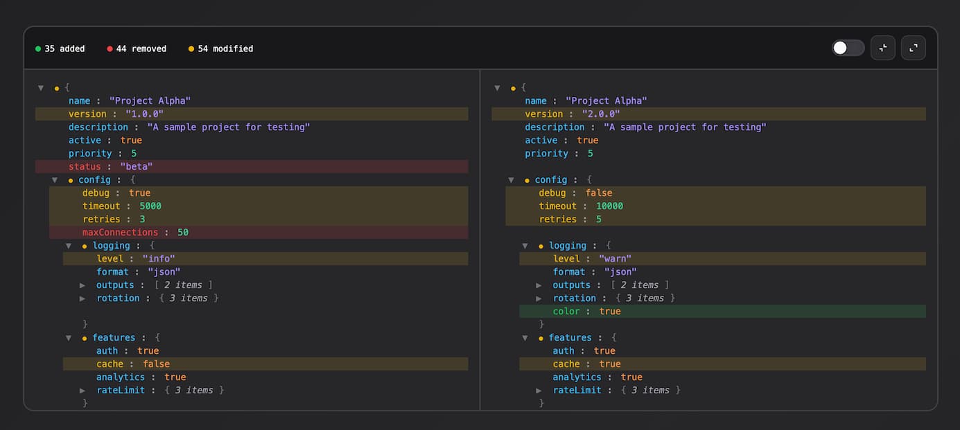
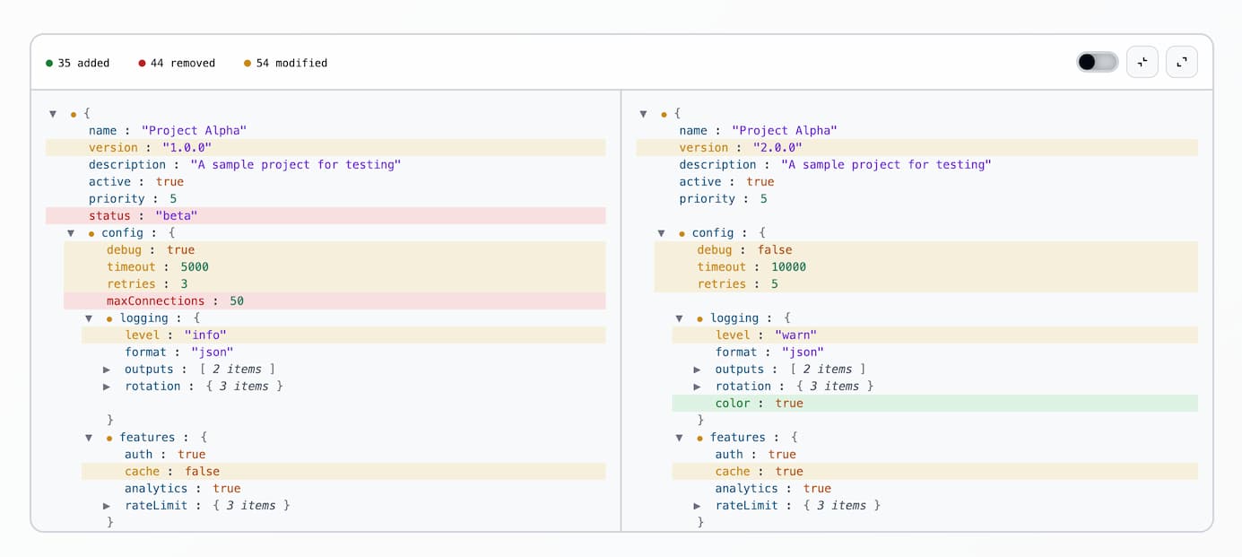
- Nested JSON comparison
- Side-by-side synchronized scrolling
- Collapsible nodes (synced between panels)
- Diff indicators roll up to parent nodes
- Stats summary (added/removed/modified)
- Show only changed filter toggle
- Syntax highlighting
- Zero dependencies
- Shadow DOM encapsulation
npm i json-diff-viewer-componentEvery integration needs three things:
- Import the package once to register the custom element.
- Add
<json-diff-viewer>to the page. - Provide both values using one of the data APIs below.
Import the package:
import "json-diff-viewer-component";<json-diff-viewer></json-diff-viewer>Choose one data API. Root values must be non-null.
Use for dynamic data. Both values update in one render:
const viewer = document.querySelector("json-diff-viewer");
viewer.setData(
  { name: "foo", enabled: true },
  { name: "bar", enabled: true },
);Use when assigning JavaScript values independently. Rendering starts once both sides are set:
viewer.left = { name: "foo" };
viewer.right = { name: "bar" };

console.log(viewer.left, viewer.right);Use only for small, static, inline JSON. Each value is parsed with JSON.parse(), so invalid JSON throws:
<json-diff-viewer
  left='{"name":"foo"}'
  right='{"name":"bar"}'
></json-diff-viewer>
Prefer setData() or properties for objects already available in JavaScript.
The registered class is exported only when a class reference is needed for testing or extension:
import { JsonDiffViewer } from "json-diff-viewer-component";No setup is required. The component toolbar includes:
- Show only changed: filter toggle (default: on); hides unchanged nodes
- Collapse all / Expand all: bulk expand/collapse
- Node toggles: click any object/array line to expand/collapse (synced across both panels)
The component remains the same custom element and uses setData() for reactive values.
React and Vue examples
import { useEffect, useRef } from "react";
import "json-diff-viewer-component";

function DiffViewer({ left, right }) {
  const viewerRef = useRef(null);

  useEffect(() => {
    if (viewerRef.current) {
      viewerRef.current.setData(left, right);
    }
  }, [left, right]);

  return <json-diff-viewer ref={viewerRef} />;
}<template>
<json-diff-viewer ref="viewerRef" />
</template>
<script setup>
import { ref, watchEffect } from "vue";
import "json-diff-viewer-component";
const props = defineProps(["left", "right"]);
const viewerRef = ref(null);
watchEffect(() => {
viewerRef.value?.setData(props.left, props.right);
});
</script>| Type | Default | Description |
|---|---|---|
| Added | Green | Key exists only on the right |
| Removed | Red | Key exists only on the left |
| Modified | Yellow | Values differ, or a container has changed descendants |
The component is fully usable without style configuration. Override CSS custom properties on json-diff-viewer. They inherit through the host into its shadow DOM. State foreground tokens also drive their derived backgrounds unless those backgrounds are overridden separately.
Tokens inherit through the host. Override only the values your theme needs.
json-diff-viewer {
  /* Diff colors */
  --add: #22c55e; /* Added items */
  --rem: #ef4444; /* Removed items */
  --mod: #eab308; /* Modified items */

  /* Backgrounds */
  --bg: #18181b; /* Main background */
  --bg2: #27272a; /* Panel background */

  /* Borders */
  --bdr: #3f3f46; /* Border color */

  /* Text */
  --txt: #fafafa; /* Primary text */
  --dim: #a1a1aa; /* Dimmed/secondary text */

  /* State backgrounds */
  --add-bg: color-mix(in srgb, var(--add) 15%, transparent);
  --rem-bg: color-mix(in srgb, var(--rem) 15%, transparent);
  --mod-bg: color-mix(in srgb, var(--mod) 15%, transparent);

  /* Controls and interaction */
  --hover: rgb(0 0 0 / 3%); /* Diff row hover */
  --control-bg: var(--bg2); /* Action button background */
  --control-hover: rgb(0 0 0 / 5%); /* Action button hover */
  --control-bdr: var(--bdr); /* Action button border */
  --slider: var(--bdr); /* Slider active track */
  --slider-thumb: var(--br); /* Slider thumb */

  /* Syntax highlighting */
  --key: #38bdf8; /* Object keys */
  --str: #a78bfa; /* String values */
  --num: #34d399; /* Number values */
  --bool: #fb923c; /* Boolean values */
  --nul: #f472b6; /* Null values */
  --br: #71717a; /* Brackets and braces */
}
Create your own theme by overriding these tokens. For example, a light theme:
json-diff-viewer {
  --add: #15803d;
  --rem: #b91c1c;
  --mod: #ca8a04;
  --bg: #f4f4f4;
  --bg2: #f9fafb;
  --bdr: #d1d5db;
  --txt: #030712;
  --dim: #4b5563;
  --slider: #d1d5db;
  --key: #075985;
  --str: #6d28d9;
  --num: #047857;
  --bool: #b45309;
  --nul: #a21caf;
  --br: #6b7280;
}Use ::part() for structural overrides that are not shared design tokens:
| Parts | Elements |
|---|---|
toolbar, legend, legend-item, legend-added, legend-removed, legend-modified |
Summary and state legend |
actions, filter, filter-track, action-button, collapse-button, expand-button |
Viewer controls |
content, panel, panel-left, panel-right |
Diff layout and panels |
node, node-added, node-removed, node-modified, line |
Diff nodes and rows |
toggle, marker, marker-added, marker-removed, marker-modified |
Node controls and state markers |
key, separator, value, value-string, value-number, value-boolean, value-null |
JSON content |
bracket, preview, empty |
Supporting content and empty state |
Elements can expose multiple parts, so generic and specific selectors compose:
json-diff-viewer {
  --add: lime;
  --add-bg: color-mix(in srgb, lime 20%, transparent);
}

json-diff-viewer::part(toolbar) {
  border-block-end-width: 4px;
}

json-diff-viewer::part(node-added) {
  border-inline-start: 3px solid var(--add);
}

json-diff-viewer::part(collapse-button) {
  border-radius: 999px;
}
Parts are the supported structural API. Internal classes and other shadow elements remain private. ::part() cannot select descendants, so target each listed part directly. Changing layout, padding, or typography on node and line can desynchronize corresponding rows between panels.
Set a height to get scrolling. Without one, the viewer grows to fit all content. Default border-radius is 12px.
json-diff-viewer {
  height: 600px;
  border-radius: 16px;
}
For full-height layouts, use flexbox:
.container {
  display: flex;
  flex-direction: column;
  height: 100vh;
}

json-diff-viewer {
  flex: 1;
  min-height: 0;
}npm run dev # start dev server
npm run build # build for production
npm run preview # preview the production build